Friday, 31 January 2014

VFX Post-Production - Colour Grading

Since I'm working in RAW I wanted to be able to get the most out of my RAW DNG footage. Davinci has a great system ready to take the intensity, before there was a lite version only companies with good budgets could afford it. Now your average Joe can take a look and make some great content. I already have the idea in my head of how I wanted to colour this work.

[NOTE - Unfortunately Google has decided to auto enhance my images since it thought they were a little dark, and so the colouring doesn't looking totally right on these images, but rest assured they are great.]

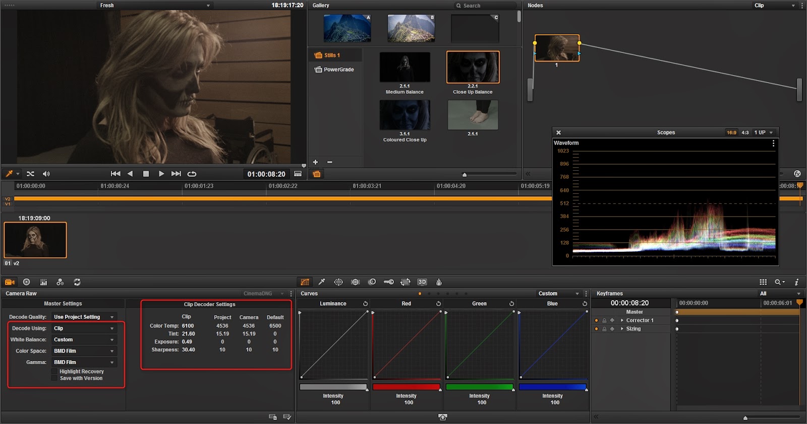
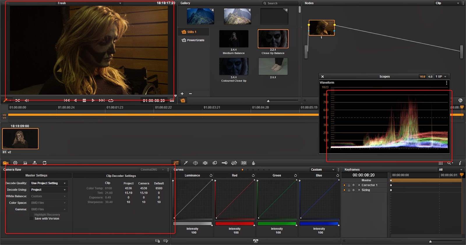
So first off I took my footage into Davinci timeline and went to the colouring (If you want to see how I did that then you can check my previous post about it). As you can see the footage is extremely yellow and you might first think that's a problem but since the footage was shot in RAW I have the ability to edit the temperature with no quality loss.

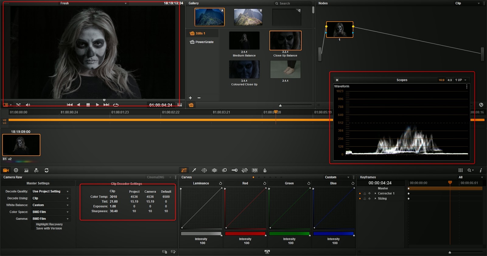
If I change the "Decode Using" to clip it will recognise the Black Magic camera and enable the RAW input. Now I can edit the Clip Decoder Settings that were not usable earlier.

Using these I can change my temp, ting, exposure and sharpness. So with a few tweaks I will able to balance out my image. What I was looking for was an almost white scope that you can see on the right. If you compare it to the image above you will see.

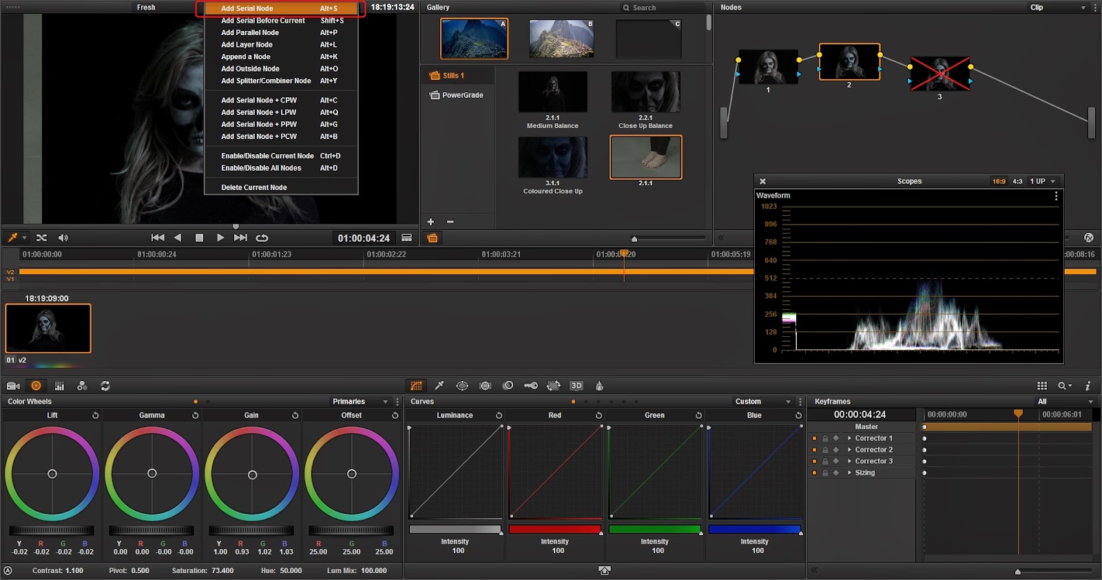
Davinci has a great in built functionality called 'nodes' which represents non-destructive workflow. If I am mindful and add each step as a node then I will have full control over my image. Now I'm going to up my Saturation a little bit to bring in her colour, while shifting the exposure down a little my highlights are too much.

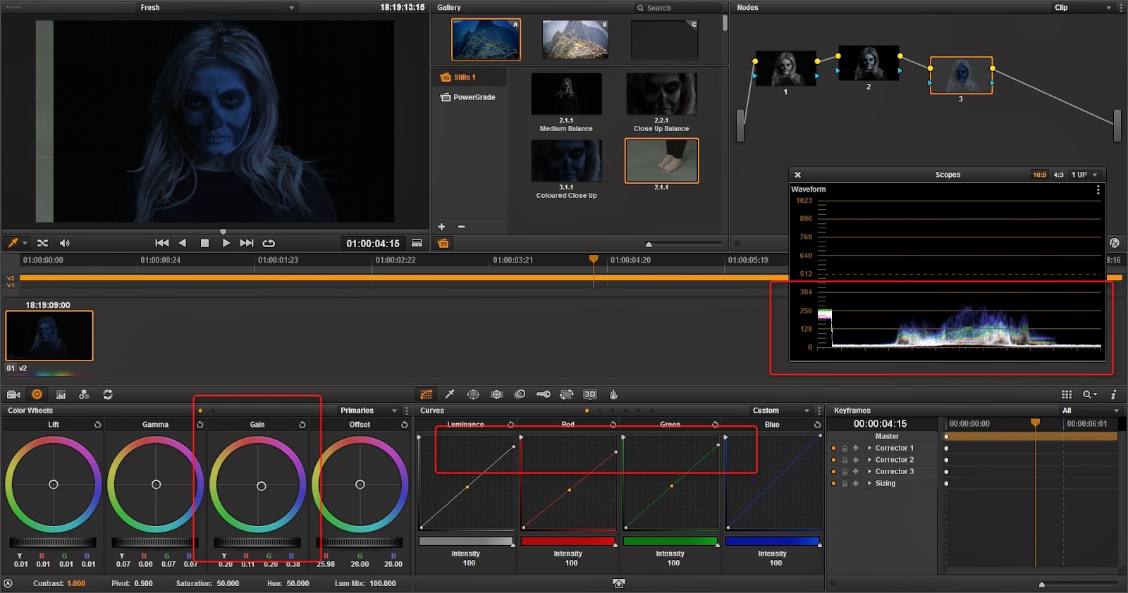
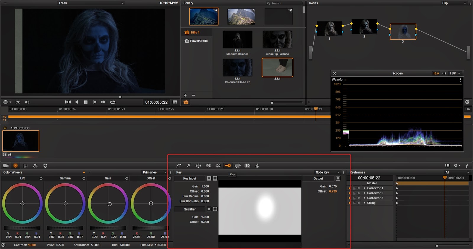
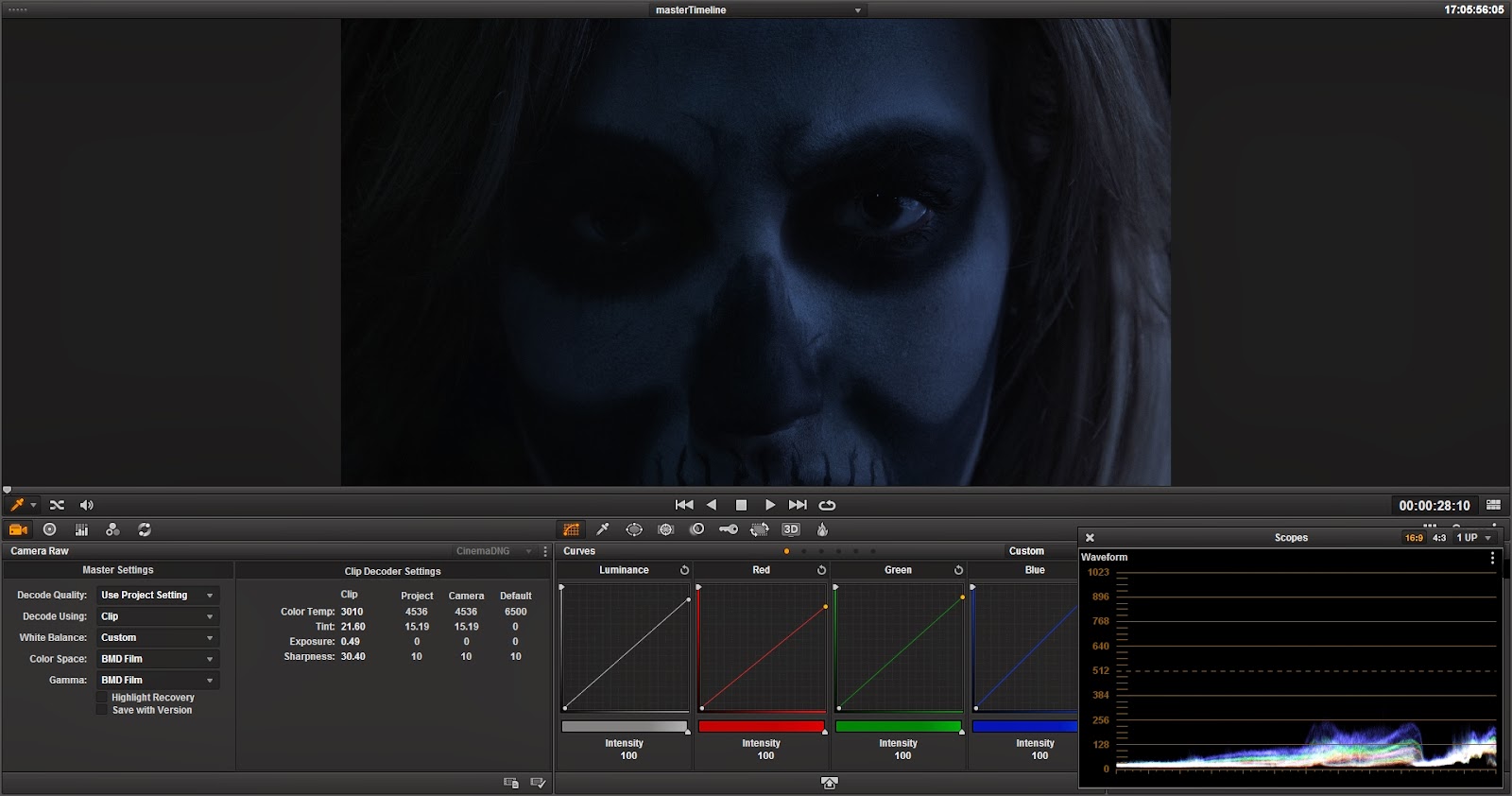
I'll add my next node again, and this time I want to really wash the the whole shot blue because it's meant to be in darkness but the illusion is it's still light but the blue automatically makes you think of it being dark. Lift, Gamma and Gain represent shadows, mid-tones and highlights. I'm slowly going to shift away from the warmer region until I get a nice blue colour. As I did this I noticed the hair was becoming too blue, so to rectify this I decided to add a mask to only the face.

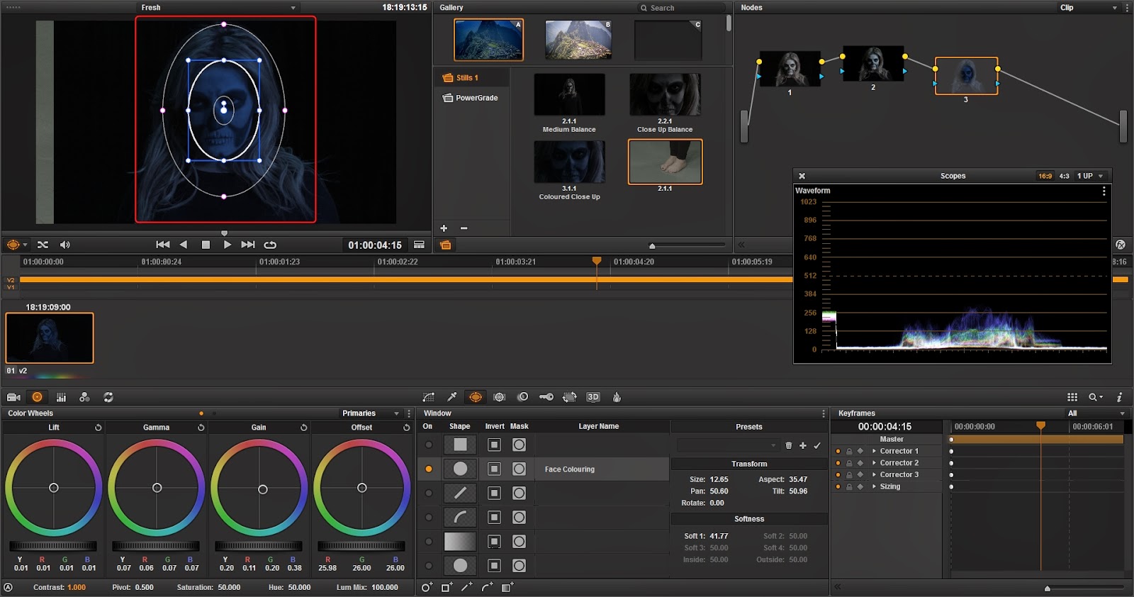
Going to the third tab in the middle bottom window, I get the masking options. I have never seen a tracking pretty much as good as this it's great, I drew a quick eclipse over her face and I could see it's effect by looking at the top right in my node box.

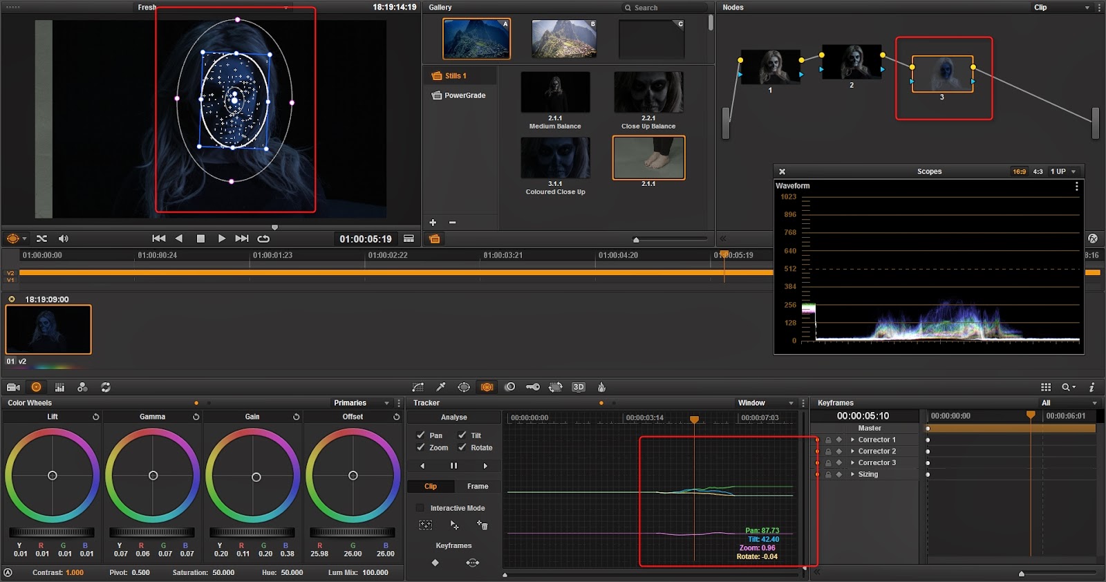
In this shot there is a full 180 degree pan of my subject and the mask obviously doesn't following her. So going to the next tab across I can use the analyse options to track the footage of which it did an incredible job. This blow adobe after effects out of the water.

Now instead of trying to mess with my settings, I can use the Gain and Offset options to blend the effected and unaffected area together. This is pretty the point where I'm happy, as I mentioned Google has tried to balance the images and made it look totally wrong. There was some balance between each image but almost perfect across.

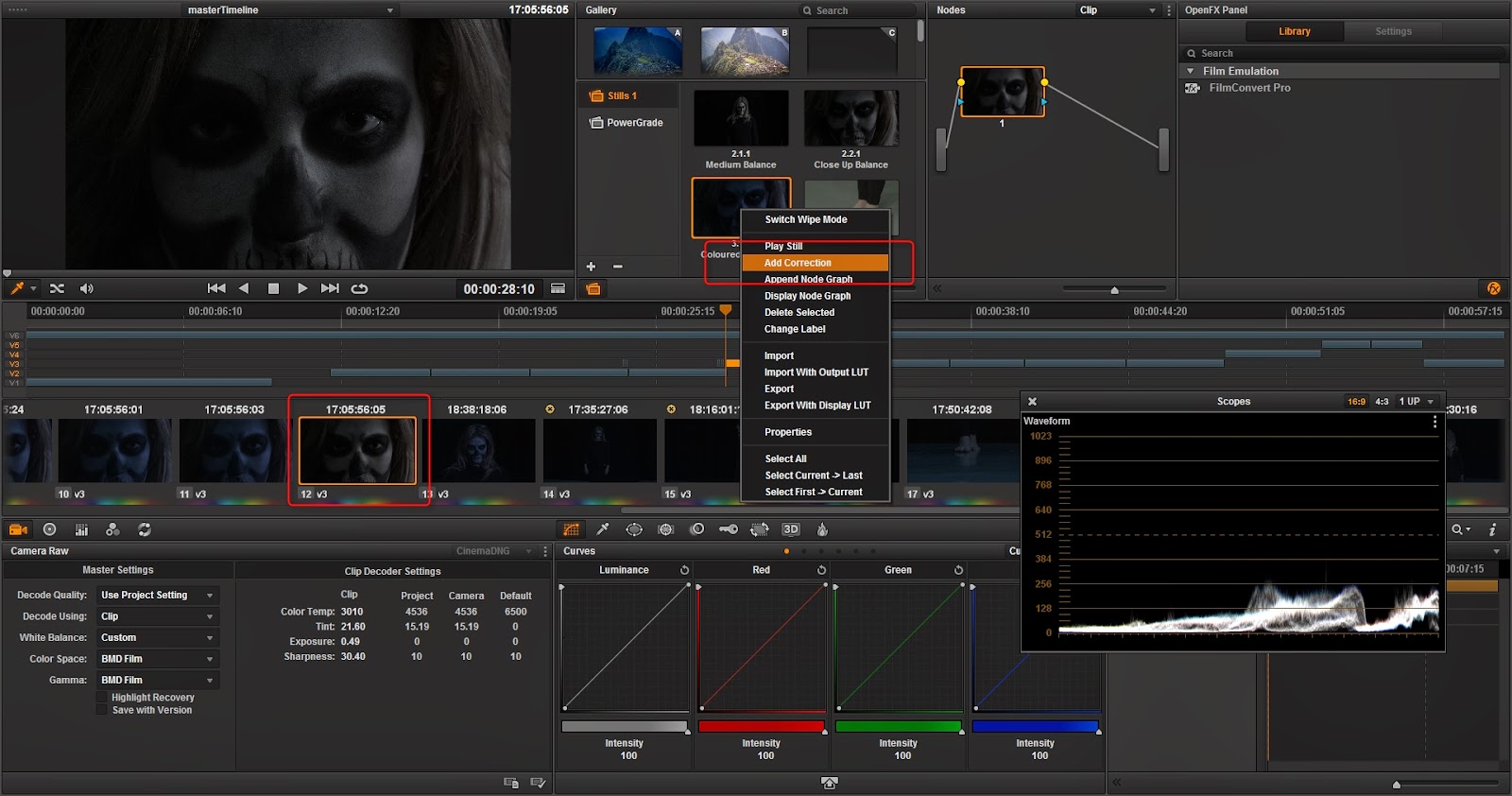
So I took my rough cut and went through grading the rest of my images. What's great is I can take a 'snapshot' of all the settings on a node and have it use on any other image. In this close up shot I can click "Add Correction"  and instantly have all the settings go across. This makes my process so much quicker.


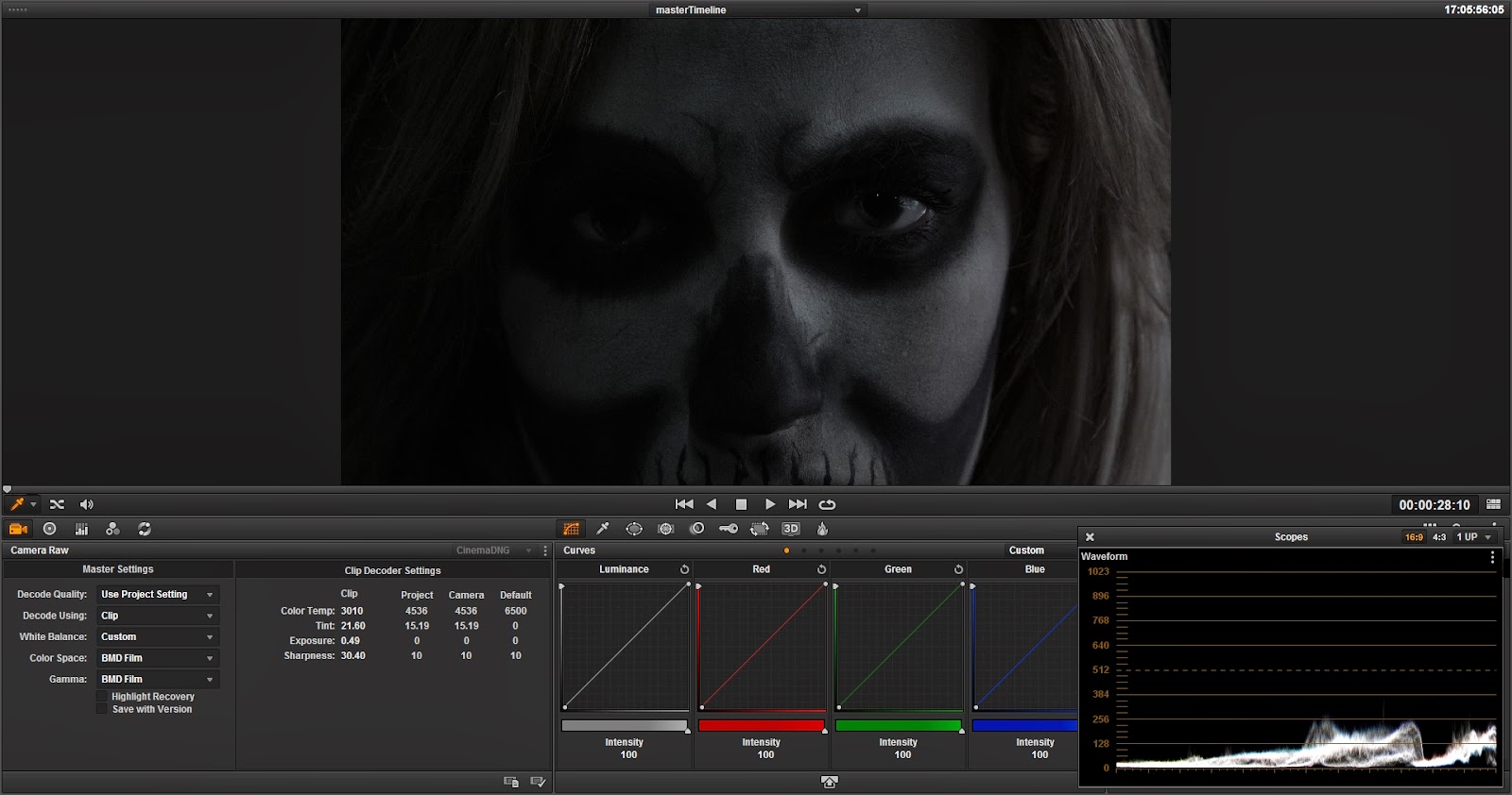
So here is a, before (balanced) and then after my grading. It didn't need to be much but I definitely wanted to blue wash to indicate that night time, darkness look.

Tuesday, 28 January 2014

VFX Post-Production - Rough Cut

So just like I explained in my last blog post, using the DNG RAW workflow I've come to know. I have now been able to put together a rough timeline of my video, no colouring, no nothing. Which I can then export back to Davinci and colour grade with out losing any quality what so ever!


For show I thought I would render out the rough cut aswell, I can at least use this in my final render post and show exactly where I have come from. As you'll have noticed there is a blackness at the beginning and this is just for the intro space. Also I have settled on a piece of audio that I did mention in my earlier posts entitled "Sail - Awolnation" and I have fitted my video to the accents of the song, it is so damn powerful when latching on to those sharp, flamboyant sounds. Changing the shot directly with each pound, giving a sense of connection and thoughtfulness.

Saturday, 25 January 2014

VFX Post-Production - RAW Footage Workflow

Since I was able to record all my footage in RAW totalling to a massive 60gb for only 8 minutes worth of footage (geez). I wanted to make sure I had the perfect workflow and of course use the program that was built specifically for Black Magic Cameras; Davinci Resolve! Working with files as complex as these are going to slow my computer down if I don't do this correctly so I want to make sure I get the correct workflow down utilising what is know as proxy footage (lower quality rendered footage of the originals which can be reference in another program and then re-assembled back in your core program). 

For example I am going to be doing a very quick work flow with my own footage working between Davinci Resolve 10 and Adobe Premire CC. [Edit - The strange thing is I've realised that Davinci now has a fully built in timeline system, but I would still prefer to use work in a program that I would use everything else other than raw in]. In illustration form this is what I'll be showing.


Firstly I'm going to set up my project and footage and bring them into Davinci Resolve. In a folder view the DNG RAW files just show up a separate images representing each frame, but if we look at the second image Davinci instantly recognises them and merges them into a sequence for you. Double click each sequence will add in to the media pool for you. Once that is done, for the sake of the workflow, I'm going to go to the timeline and only add in three different pieces of footage; I also gave them a quick grade balance out how warm they all were.
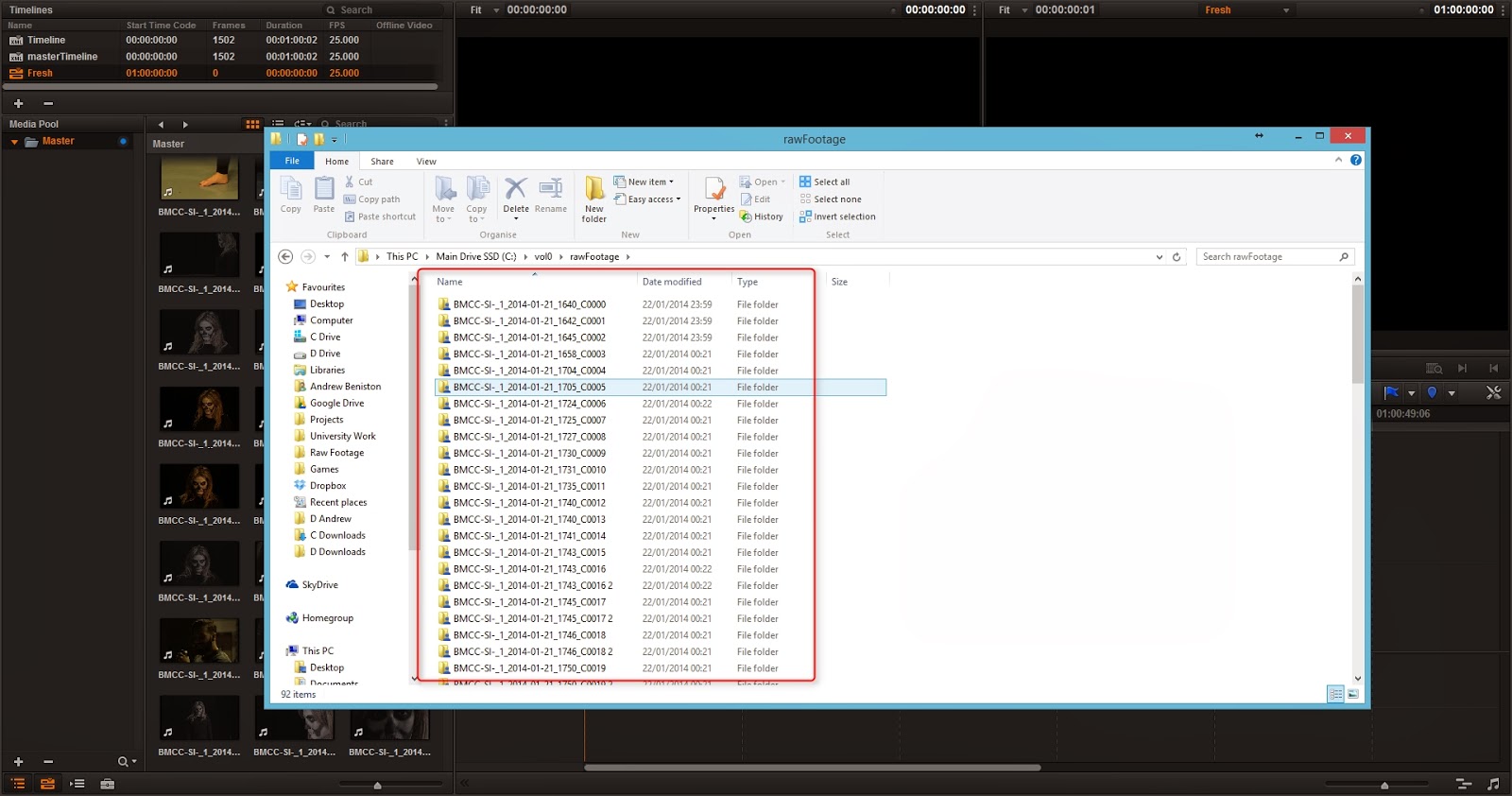
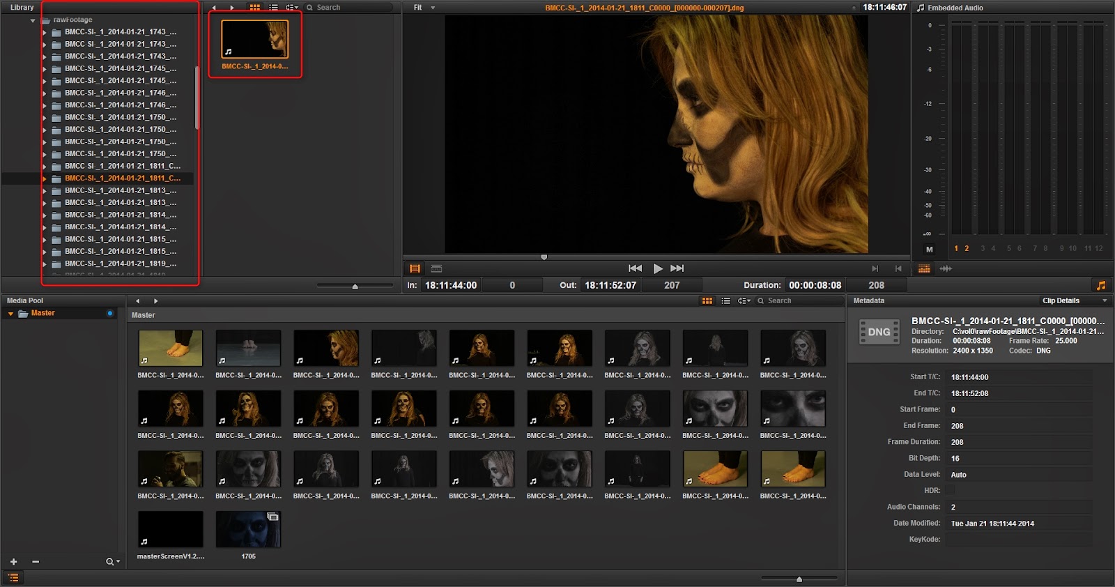
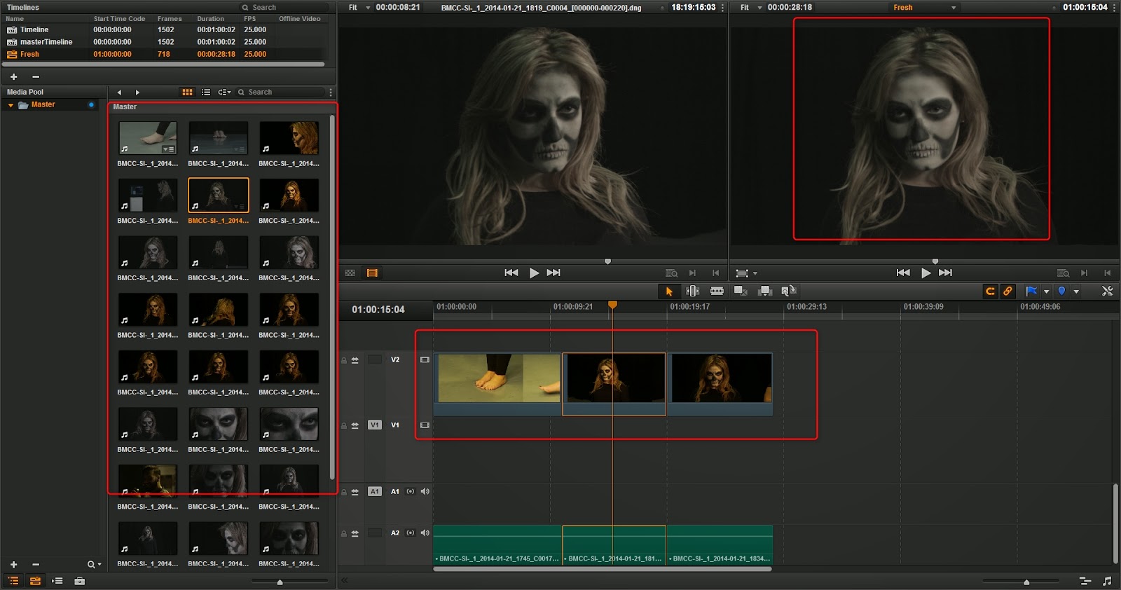
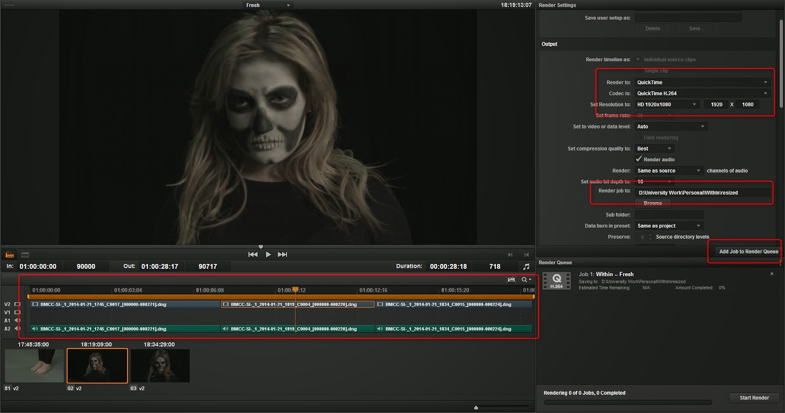
Once this is complete, we can take this footage out to render so we can get our proxies. On the delivery page I simply to choose the set up as "Final Cut Pro", choose your render codec mine is shown on the first image below. Now even though it's 2.5k footage, this is one purpose that proxies are for, you can edit small files and still keep still have a great workflow. Choose your destination folder (usually the same folder but in the sub option you just write 'proxys' and they will render out there. Of course don't forget to select all your clips in the timeline demonstrated. After we have rendered we can then go to our file explorer and see them exactly where they should be.
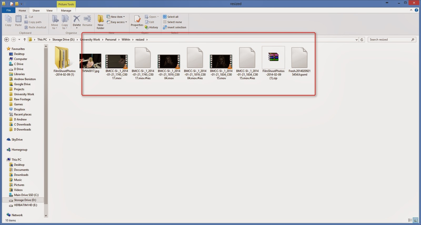

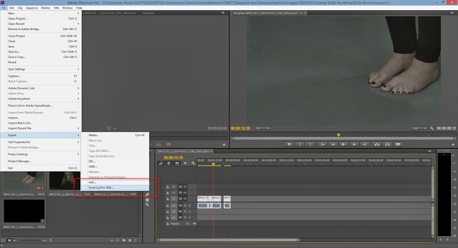
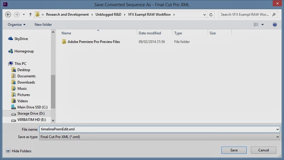
Now we need to open up our chosen editing tool, mine is Adobe Premiere Pro. Locate your footage and import them, create a new sequence and do your editing. For the purpose of this workflow demo I just moved them around a little and cut them up some. Once you're happy with your edit you can now go File > Export > Final Cut Pro XML. Save this file in your Davinci Project folder with an appropriate name.
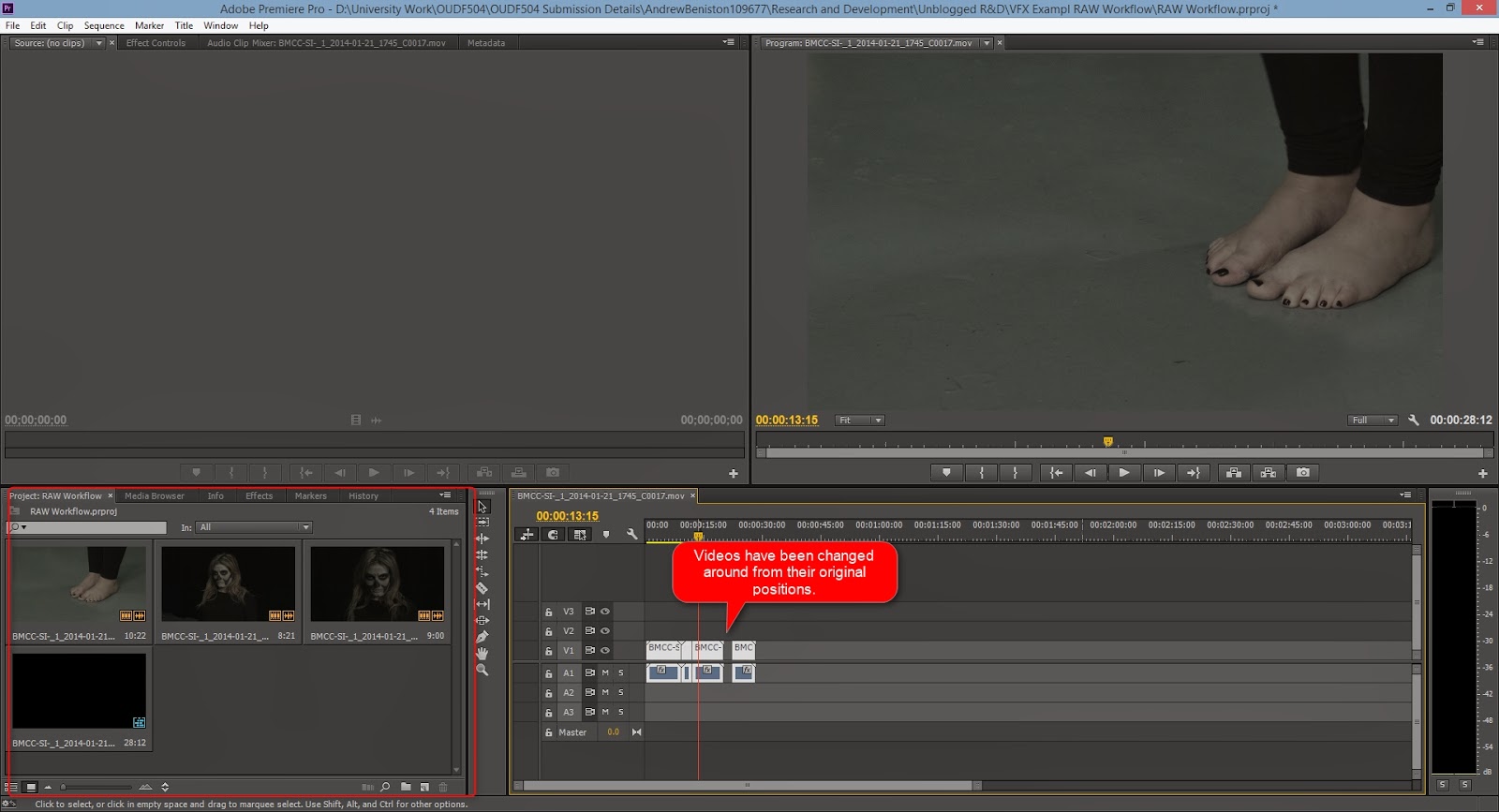
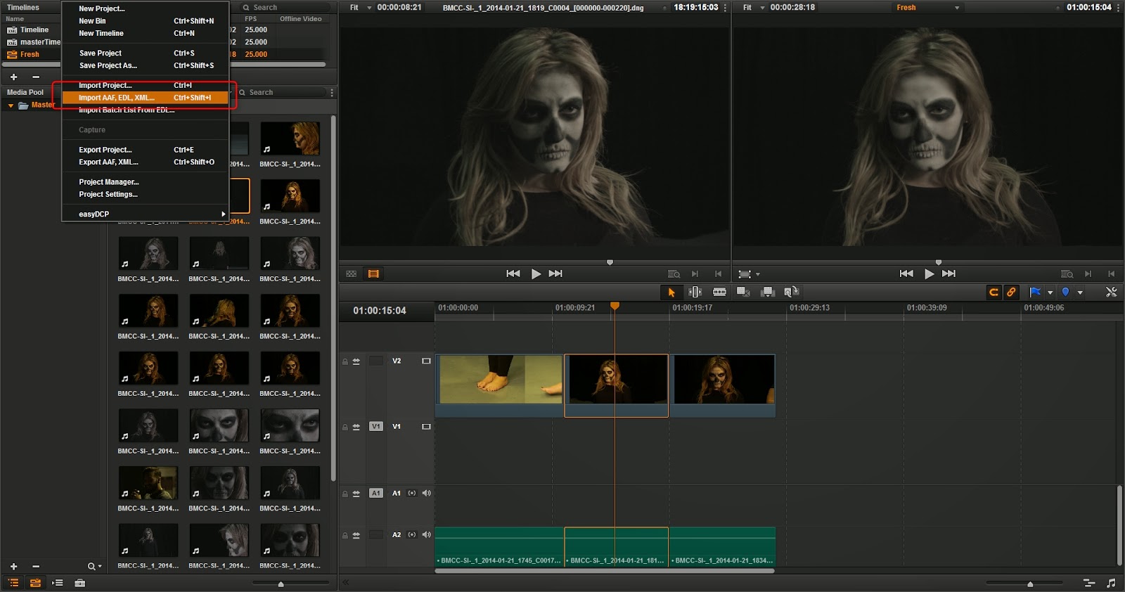
Now after our footage is cut up we can go back to Davinci where we started. Once we have our project loaded go to File > Import AAF, EDL, XML and locate your xml export from Premiere. It is VERY important that you untick the "Automatically import source clips into media pool" this will link your xml information to your low quality proxy's' and that's not what we want. Once this is all done click and okay and there we're done. You have now a rough or finished cut of your footage and your colour grader can go to work on colour grading with no problems, and what's best is he can export his timeline whenever he likes or he import another one from you and all their colour grading will absolutely safe.
Thursday, 23 January 2014

VFX Post-Production - Intro Sequence

In this blog post I'll be going over how I settled on and reached my final intro sequence to my vfx film. I have placed the final video at the top so you can see the finished piece. Though I would like any reader to understand the steps I took to get to this point (to some it will be easy, to others it could prove more difficult).


Concept Idea

The first idea I initially wanted to go with was some kind of definition of what the word "Within" stood for. Along with my own variation of this, it would be doubtful anyone would have the time to read in in such a short amount of time; though the effect it's self seemed great. I was going to make it a 3D layer with some great depth of field blurs and a few dusty particles.


First Iteration

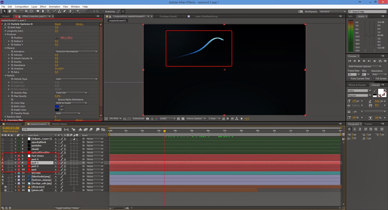
Then I decided to go with something a little more simple, that could incorporate a wisps. A little sneak preview of what is to come if you will. I started by searching around for a font that I liked, this font 'Vetka' slightly reminded me of avatar but I wanted a simple thin font and this worked great. I keyed a 'Gaussian Blur' effect to the text to have it blur in and out of focus instead of a simple fade.


As you can see in the method above, I am using the same technique as in my previous wisps tests. Using the 'CC Particle Systems Systems II' I could come up with some simple but still elegant. I also decided to take away the blur for the title and have a slowly enlargement with a simple fade in and fade out; slow movement always gives that sign of suspense and puts people on edge. Other than once again linking my particle system to a null object and using that to move it around in 2D space, I had only duplicated the particle layer to give it a little more thickness and a different colour.


Second Iteration

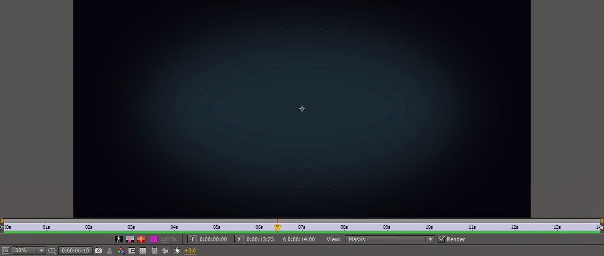
This is the point where I decided to make quite a few big changes, I didn't like the pure simple black background. I wanted other moving elements to compliment the wisp and it's environment. As you can see from the first image below I have added many more components to get the look out of my intro. Firstly I have two separate images that make up the background.


Next was the change to my title, nothing major. Instead of white it's now a tint of blue with a slight glow and Gaussian blur, options are in the image.


Then I went on to add the the next elements, which may looks like they're in the background but are in actually fact over the top of everything and I'll explain why.


Firstly I used the 'Optical Flares' plugin from Video CoPilot, I simply used one of their stock flares and coupled it with a 'Gaussian Blur' effect at 213.7 to give this abstract look that I could move around. Secondly I used 'Trapcode Particular' to create some smoky flat looking clouds, almost as if you were above looking down on them. I had a to tweak around with the plugin for a while before I managed to get something that I like, with only these two so far I was liking the look of my intro. Thirdly for another element I wanted to add in some kind of star or dust particle effect to give it more of a dynamic feel, this was one of the easier particle systems to make; by simply turning down most of the gravity and velocity effects, increasing spread and changing the randomiser for size over life I quickly had a small dust particle operating. Finally to finish that part off I added an adjustment layer with the two cylinder masks, I cranked up their feathering and then added a blur; again it was just another thought that would add another element to my intro.


Lastly for the part I have already spoke about, the wisps. All I did in this iteration the enhance them was duplicate the layer few times, displace them and finally slightly change each of their colour. I do slightly change this however it was a step in the right direction. Below is a quick breakdown of the second iteration.


Third Iteration

Fortunately the second iteration is where most of the hard work was done, all I really did in the third was add more glow to my wisps as I didn't feel as though it stood out enough. I also had the title stay Gaussian blur a little longer while the wisps quickly comes in to full focus, we get a shift of attention half way through.


It was as simple as that, for a while I was happy with it and didn't it needed any more change. Below is the third iteration video.


Final Iteration (As Seen at the Very Top)

My last iteration came around when I was working on my audio, after finally placing it in I realised I wanted my wisps to have a more prominent head; this was a simple fix and simply added a Video CoPilot 'Optical Flares' effect which gave me massive control over the flare. All I really wanted it to be was a glowing ball so I quickly created my own preset and used that. Lastly I made the particle clouds a little more frequent just to add the environment as a whole, it really brought it all together.


And thus I ended up at my final piece of work. I've took each iteration and made one video that swipes through each to show the difference from one to the other. I would probably say I could of spent a little more time making this organised and pre-composing a little more efficiently. Though trying to pre-compose back through work that has may attributes already is very hard and annoying to fix, so I would just leave them there.


Monday, 20 January 2014

VFX Production - On the Shoot

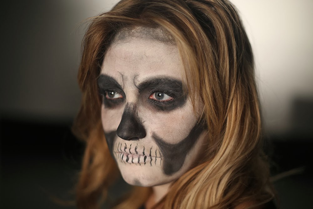
Below are the images taken by me and some Kirsty Layton (Make Up Artist) on the day of my film shoot. As you can see there looks to be a progression from start to finish with Sophie getting her make up on and filming. You'll notice that there aren't many photos directly looking at the filming and that's because well it would of been boring because it was the same movement over and over again just in different camera angles.

You will also notice I took on a fully directorial role in the photos, after learning that one of my course mates had bought a camera that was capable of doing RAW footage I was eager to ask him for it's services. My course mate Simon was of course happy oblige since it was brand new to him and also wanted to get a handle on the new Black Magic Camera. Since it was his camera and his first time using it, I decided it would be better he do the camera work and I just confirm the shoot before filming; he has great experience in shooting anyway so I had no doubt that he would create some great footage.  What was awesome is that we were monitoring from an output screen that was showing the full quality image, live. I was able to see exactly what I was going to get thanks for the Black Magic Camera.

It's great to see smiles on the photos as well, it's let me know that my crew had a good time shooting this because I know I certainly did; there is nothing more for fulling than seeing a shot you've had in your head for a long time finally come to life. One of my favourite parts was when we had about finished, but I wanted to see if I could get one more shot that replicated a wisp shooting through Sophie's hair. We tried a number of different ways and at one point it was literally perfect and shouted yes under my voice, causing Sophie to then laugh along with everyone else.

I have happily allowed my sister, Simon and Sophie to both take these images and when the work is done to use in their portfolio, without them I wouldn't have been able to shoot my idea so they get as much right to it as me.