Concept Idea
The first idea I initially wanted to go with was some kind of definition of what the word "Within" stood for. Along with my own variation of this, it would be doubtful anyone would have the time to read in in such a short amount of time; though the effect it's self seemed great. I was going to make it a 3D layer with some great depth of field blurs and a few dusty particles.
First Iteration
Then I decided to go with something a little more simple, that could incorporate a wisps. A little sneak preview of what is to come if you will. I started by searching around for a font that I liked, this font 'Vetka' slightly reminded me of avatar but I wanted a simple thin font and this worked great. I keyed a 'Gaussian Blur' effect to the text to have it blur in and out of focus instead of a simple fade.
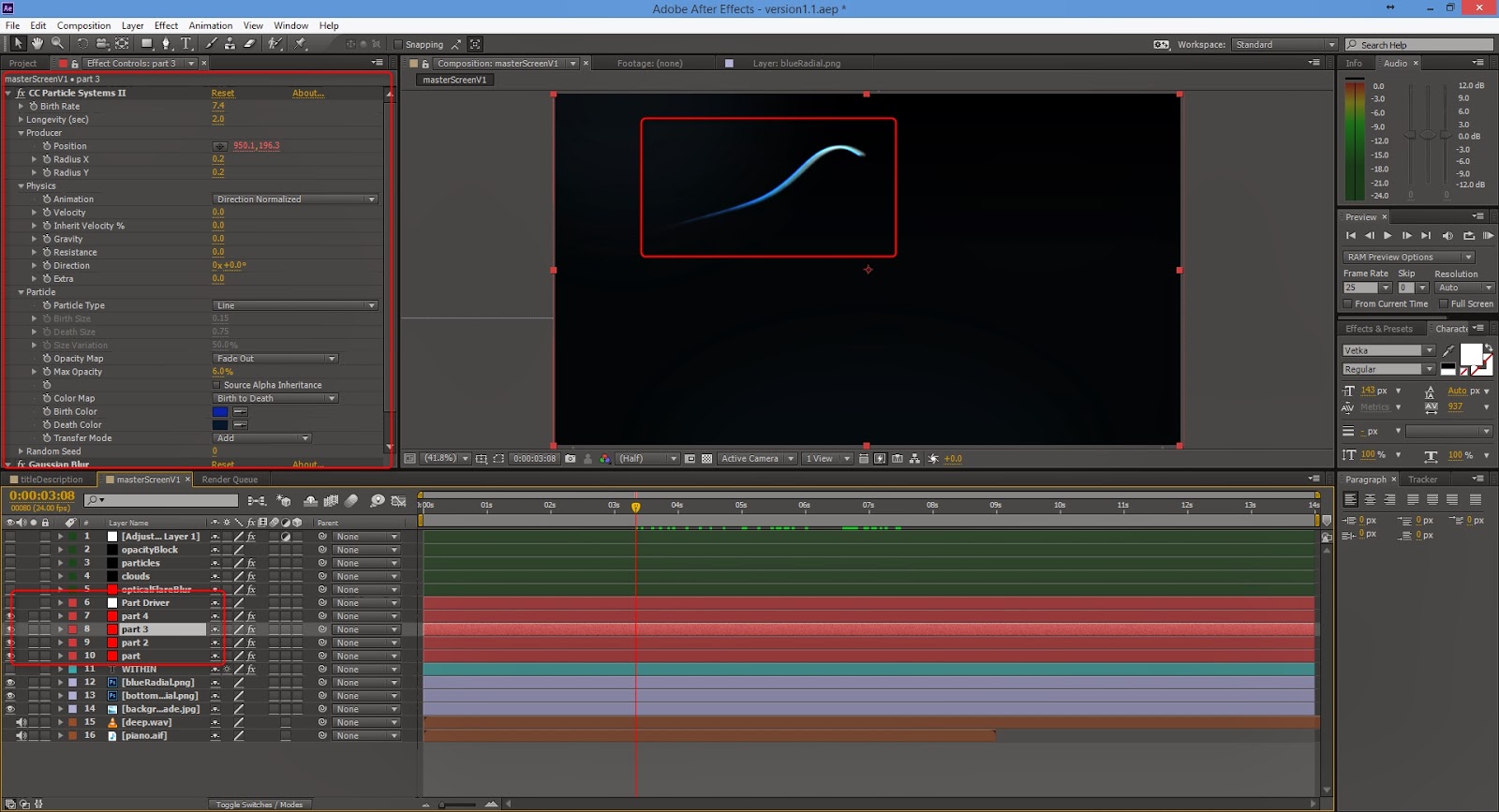
As you can see in the method above, I am using the same technique as in my previous wisps tests. Using the 'CC Particle Systems Systems II' I could come up with some simple but still elegant. I also decided to take away the blur for the title and have a slowly enlargement with a simple fade in and fade out; slow movement always gives that sign of suspense and puts people on edge. Other than once again linking my particle system to a null object and using that to move it around in 2D space, I had only duplicated the particle layer to give it a little more thickness and a different colour.
Second Iteration
This is the point where I decided to make quite a few big changes, I didn't like the pure simple black background. I wanted other moving elements to compliment the wisp and it's environment. As you can see from the first image below I have added many more components to get the look out of my intro. Firstly I have two separate images that make up the background.
Next was the change to my title, nothing major. Instead of white it's now a tint of blue with a slight glow and Gaussian blur, options are in the image.
Then I went on to add the the next elements, which may looks like they're in the background but are in actually fact over the top of everything and I'll explain why.
Firstly I used the 'Optical Flares' plugin from Video CoPilot, I simply used one of their stock flares and coupled it with a 'Gaussian Blur' effect at 213.7 to give this abstract look that I could move around. Secondly I used 'Trapcode Particular' to create some smoky flat looking clouds, almost as if you were above looking down on them. I had a to tweak around with the plugin for a while before I managed to get something that I like, with only these two so far I was liking the look of my intro. Thirdly for another element I wanted to add in some kind of star or dust particle effect to give it more of a dynamic feel, this was one of the easier particle systems to make; by simply turning down most of the gravity and velocity effects, increasing spread and changing the randomiser for size over life I quickly had a small dust particle operating. Finally to finish that part off I added an adjustment layer with the two cylinder masks, I cranked up their feathering and then added a blur; again it was just another thought that would add another element to my intro.
Lastly for the part I have already spoke about, the wisps. All I did in this iteration the enhance them was duplicate the layer few times, displace them and finally slightly change each of their colour. I do slightly change this however it was a step in the right direction. Below is a quick breakdown of the second iteration.
Third Iteration
Fortunately the second iteration is where most of the hard work was done, all I really did in the third was add more glow to my wisps as I didn't feel as though it stood out enough. I also had the title stay Gaussian blur a little longer while the wisps quickly comes in to full focus, we get a shift of attention half way through.
It was as simple as that, for a while I was happy with it and didn't it needed any more change. Below is the third iteration video.
Final Iteration (As Seen at the Very Top)
My last iteration came around when I was working on my audio, after finally placing it in I realised I wanted my wisps to have a more prominent head; this was a simple fix and simply added a Video CoPilot 'Optical Flares' effect which gave me massive control over the flare. All I really wanted it to be was a glowing ball so I quickly created my own preset and used that. Lastly I made the particle clouds a little more frequent just to add the environment as a whole, it really brought it all together.
And thus I ended up at my final piece of work. I've took each iteration and made one video that swipes through each to show the difference from one to the other. I would probably say I could of spent a little more time making this organised and pre-composing a little more efficiently. Though trying to pre-compose back through work that has may attributes already is very hard and annoying to fix, so I would just leave them there.
And thus I ended up at my final piece of work. I've took each iteration and made one video that swipes through each to show the difference from one to the other. I would probably say I could of spent a little more time making this organised and pre-composing a little more efficiently. Though trying to pre-compose back through work that has may attributes already is very hard and annoying to fix, so I would just leave them there.


No comments:
Post a Comment