Friday, 11 April 2014

GA - Development - Fire Elemental Particles

At this point I haven't seen the concept art for the fire elemental which then of course means not model for me to work with. However I thought I would still attempt to get ahead. We envisioned that when the elemental was in view he was be exploding with swirling particles, how close I'll be able to get to that phrase I don't know. So for now I decided to create something that would still give us an idea and something to work from. In Unity 4 there is now the new particle emitter script, so this is what I was going to use, best practice is new practice.

Is was all a matter of using the knowledge I had from previous use of the older particle system, and once you've worked with particles systems in program like After Effects you know one, you know them all. The parameters window looked more modern, though some of the options still confusing I only wanted something quick to get visual idea going.


Friday, 4 April 2014

GA - Development - Manual Animation

When I received animations from Simon, I asked to duplicate the same animation where 'Riven' offers the amulet to 'Fakiki'. On the duplicate there was to be no amulet and I would animated the section where it hovers out of his hand and over to the cauldron, with the camera and the amulet being so small; guessing where to animate it would of been impossible.

Now annoyingly for me, when I animated the amulet flying out of Rivens hand I couldn't see the hero animation happening at the same time. So instead I used trial an error to figure out the right times by running the scene over and over and getting closer each time. Eventually after a few tries I did, I parented a couple of lights with the amulet to give a small amount of dynamic lighting ensure it would stand out in a nice golden colour.

I then added a few tilts backwards and forwards to make the hovering more believable and the first shot was done! I also found that panning my camera slightly up in the shot also helped with the hover look.


Second Shot

This time with an birds eye shot panning over the cauldron, the amulet was to float right over the centre and drop in. Again I could only see one animation happening at a time, but using the key frames to know how long my camera animation took made it simple to figure out where my amulet needed to be animated, a few trial and error settings and then adding some extra tilt and roll to the object, a light to follow and it was sound. 


I also wanted the amulet to glow and the quickest way I knew how was with the image effects, however it has to be applied to a camera as it is a full screen effect. To get around this I just turned down the alpha channel in the mesh main colour on any object I didn't want to glow (everything in view except the amulet).

Friday, 28 March 2014

GA - Development - Character Import / Animations

As per the earlier post, where I spoke about setting up the shots in separate scenes. Because I had problems with getting all my animations on to one scene and I know there are many way to accomplish this and here is one.

To start with I had Simon send me all the animations in one Maya folder (Hopefully in the end we will have one master Maya folder with all characters and their animations residing inside.).

So as mentioned above, I acquired the Maya files from Simon and placed them in my assets folder. Here I could see each one and use them quickly and efficiently.

First of all I realised there was scale error between the size that Kinga had made her building model (The size I was working from.) and the scale Simon has used for the character. A small problem and with quick calculations I found that 0.35 was the correct size for 'Riven' our hero model.

Most importantly, since we are not using mechanim: a new feature of Unity. I needed to make sure my Animation Type was set to legacy, this meant that it would use the old method of running animation. The information would be read only and would essentially just play.

When that was all taken care of, I only needed to drag the animation I wanted in to my scene and an automatic 'Animation' component was created which meant it would play automatically.
Since I had previously given Simon the exact animation times and shot framing I knew that all the animations would be a simple as drag and drop. As per the video down below I was able to put this into a prefab and drop the animation straight in!


Wednesday, 26 March 2014

GA - Development - More Image Effects

MOAR IMAGE EFFECTS

The depth of field image effects is one to have in your Unity game at all times (if you have the pro version of course). Though I decided to take a look at what other options there were, now there are plenty but a wide variety are more for specialised purposes. I was looking for the general effects, I stumbled across two other I thought very helpful. 

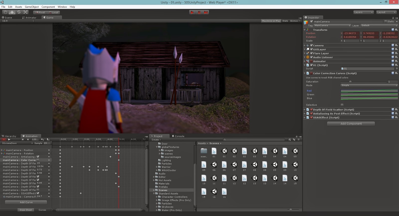
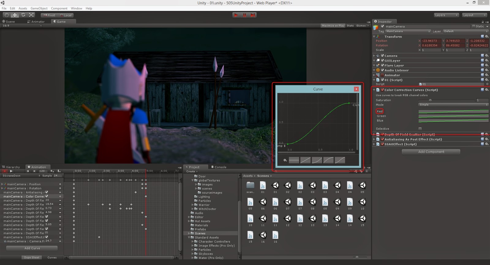
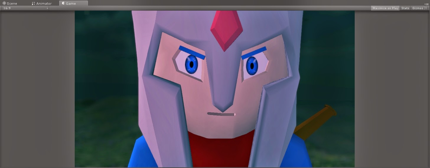
The first effect was colour correction, this what a huge bonus for me as I would be able to give the whole piece a mastering finish. Small amounts of contrast and pulling out colour where I need. As you can see a simple S curve actually worked perfectly, dulling down the red highlights but keeping the mid to lows really helped with the 'twilight' period.
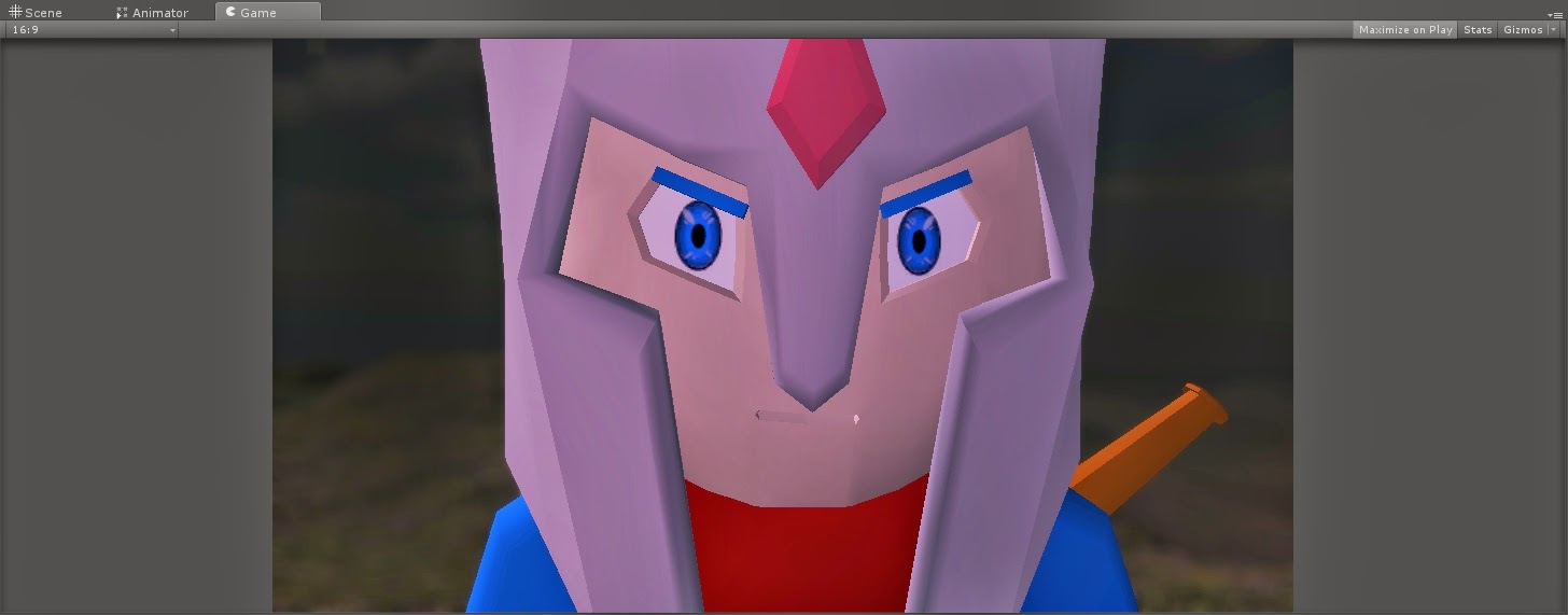
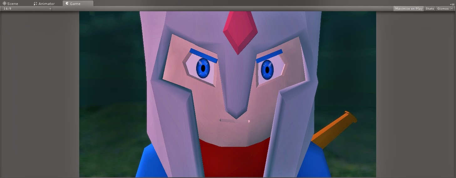
Here is another quick example. As you can see using the light purple light washed out alot of the metal in the helm, so I once easily able to pull out some of the highlights to bring back that colour.


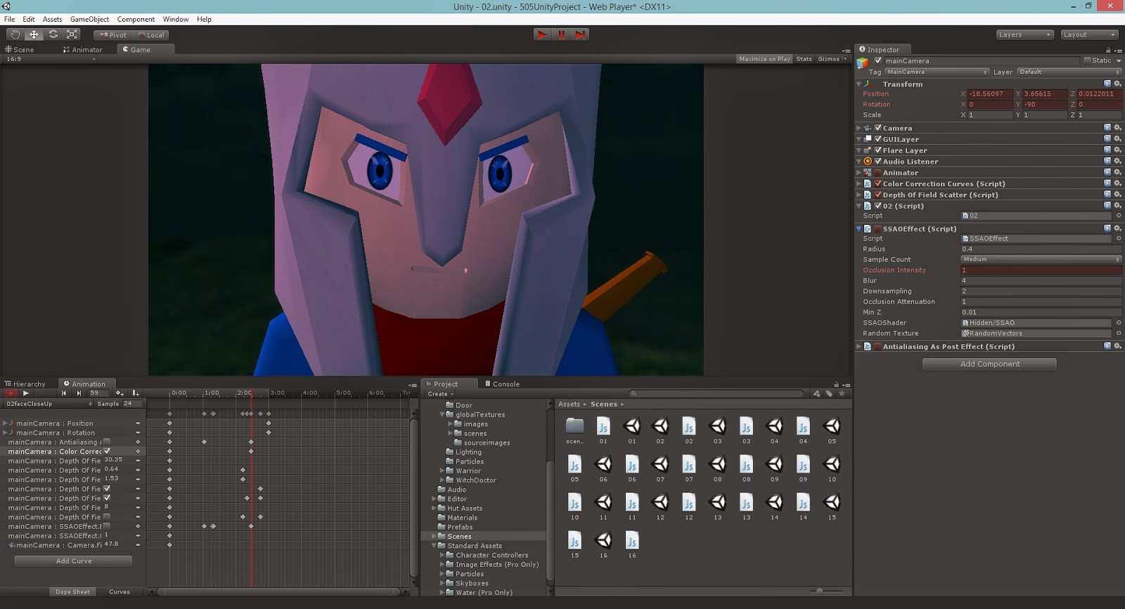
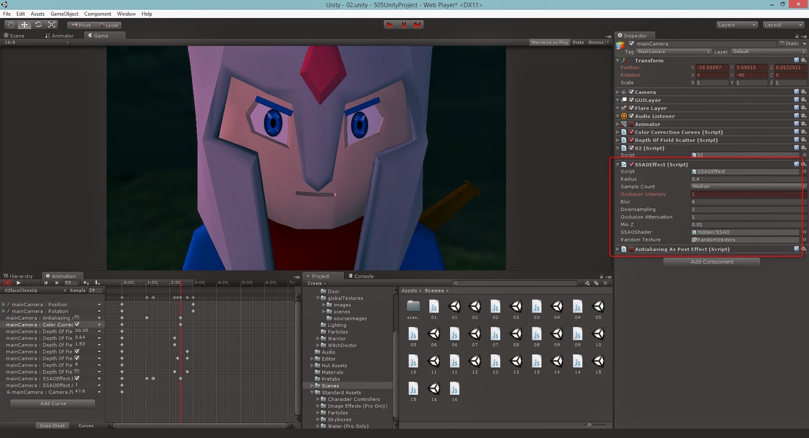
Secondly, I used the 'Screen Space Ambient Occlusion' effect which help the lighting act more realistic. If you look at the images above you can see the mouth and lower part of the eye indents are getting highlight from a light behind then. With the occlusion tool I was able to wipe that out, now this may not be exactly what it's for but it did a brilliant job in making everything look that little bit more natural.


As an extra bonus that I stumbled across, some of the models combined with camera angles resulted in really sharp edges, in the image effects I found the anti-alias and with a few short tweaks the hard edges were slightly softened.

Friday, 21 March 2014

GA - Development - Image Effects

While still waiting for some of my animations, I had the chance to play with the 'Image Effects' script and boy and I glad I did. I didn't realise it had so many extra features that can give you game so much more edge. To be honest I should of realised with the games you see today, you take it for granted and go for what is easiest with out even thinking about it.

The first one I used, and by far the best and most fun was the 'Depth of Field' script. Instantly giving you the ability to add small or massive amount of DoF to your shot. This made them look much more professional and knowing how to animate takes it to another level in terms of quality. I did find my self editing plenty of the parameters though, and took a while to figure out who to perform really shallow depth of fields.

This was probably the most enjoyable part for me, the visual button. Ticking this one gives a greymap of what is in focus and what is not. Black in, white out and everything else in between, this was the best way to quickly set a shot up with depth of field.

Though with my experimentation I found that the closer to the camera the depth of field, the more glitches would appear. You an see here that the hero is blurred, but there is no bleeding blur over the edge of his model.

After fixing around with some of the settings I found that the 'Near Blur' option was the box to tick to fix this. Also ticking high resolution and setting DiscBlur to Direct X 11 (A superior technology for rendering from modern graphics cards) gave the finishing touches to the shot. 
Here is a few shots with and without the depth of field, a real testimony to how much more advanced the game is perceived to be.


Thursday, 20 March 2014

GA - Machinima - Version 1.0


Below is a link to version 1.0 of our machinima animation, I thought it best to take a copy and upload every so often to see the difference between each iteration.


Game Art V1.0


Friday, 14 March 2014

GA - Development - Camera Shots

I've got all my scenes in place but I was still waiting for some animations to come through, I thought it would still be efficient to put together all the shots as I knew there wasn't a huge amount of movement in each one. I used unity to put together a shot last for Simon to make his life a little more easier, this way he could frame up his own shots in Maya and make sure the timing was perfect. Ergo making the peoples lives after his workflow (me) alot easier and less fiddly. However as of this moment I am still lacking any sort of strong visual from Tom to follow, so I just used his first draft story board sketch and worked from that. It turned out quite well, I have been studying the composition of camera angles for a while now and I intended to use it to my advantage.


As you can see each shot, has the number, who needs to be animated, how long the animation is and what type of animation it is. This should be plenty enough information for Si to work from especially with us both talking frequently and discussing the actual plot.

Friday, 7 March 2014

GA - Development - Setting Up Scenes

I had some trouble because of earlier workflow on getting my animations in and running at the times I would of liked them too. Which then led to complications with my camera, not controlling them but getting them to switch between one another. So instead I opted to go for a scene a shot, in total 16. Each scene would have the one animation for each character and the camera, and would run automatically to each one, efficient in a tidy sense but more costly on the real time playing.

As you can see for scene there is a separate js file that would wait the amount of animation time the camera took and then jump to the next scene. There are plenty of variables to use, e.g. animation.isPlaying would checked if the animation I chose was playing and I could of used an 'if' statement to say if not then switch to the next scene. But getting the length of animation was a little trickier in js so I decided to manually write them out since I had all the numbers already in front of me.

For some reason the project wasn't jumping to the next when ever I would run the game, however after a few minutes of research I quickly realised and remembered that they need to be added in the build settings to be compiled into the game upon hitting play.

The only final problem I found while testing this (obviously less efficient) method was that, it was loading each scene at the end of the previous, so at the end of each one there would be a slight pause that added at least a few seconds on to the whole play time. This also just gave it a really choppy look, I decided to get more things done and fix it later.

Friday, 28 February 2014

GA - Development - Setting Up The Unity Project

Since I had started to get some of the models from other members of the group, I decided now would be the time to start putting together the Unity project.

Starting, I took Kingas model hut and placed into a blank Unity project with a plan terrain object.

I then decided what scripts I would be needing for this project, to be honest I wasn't sure on what I would use image effects for at first.

For quick reference I grabbed the Terrain Assets (which is essential for quick work or even to use permanently).

I decided that 100 x 100m would be plenty of space to make a ground environment with room to spare for the fall off.

From using the skills we were taught from first year and our refresher, I quickly came up with a simple (for now) ground environment.

Our chosen place is a swamp so naturally a swamp will have water, I added day time water in first and realised it didn't look right at all.

The inside out the house was going to need an ambient glow from the only light source in the room which is the cauldron. I turned the water into night time water and that started to work really well with the rest of the environment.

After checking over the story and realising that the end colour of the cauldron was going to be fire red. I decided to start it off with a blue to get a great contrast with colours.